Input Control Widget
The Input control allows users to submit values to variables through a form.
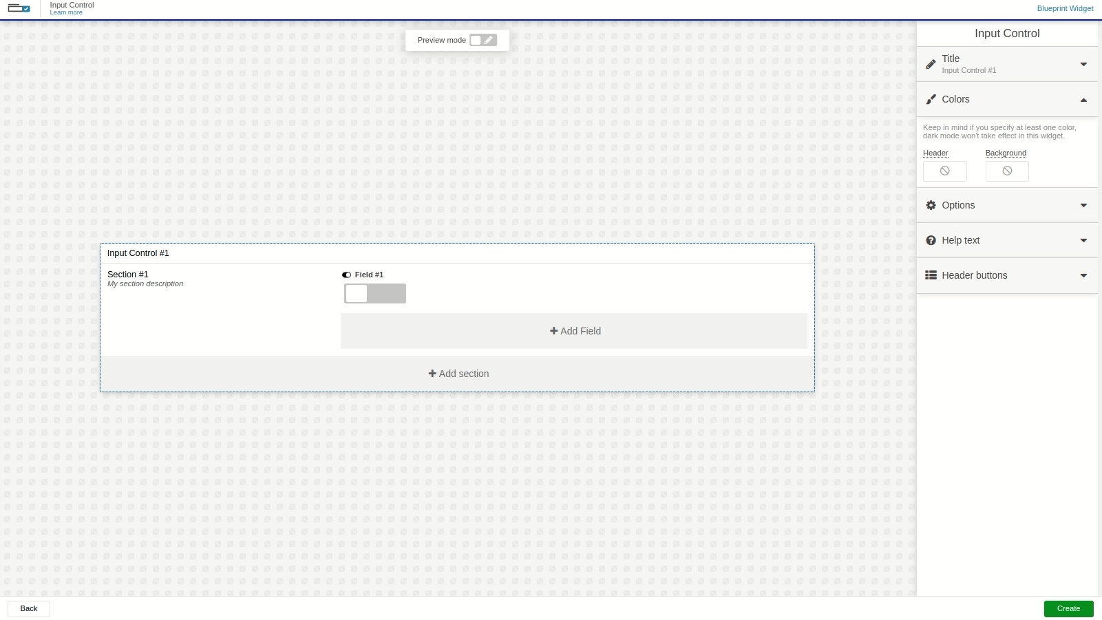
Editing the form
The Input Control is a dynamic widget. You can customize its colors, layout, text, and icons.
To edit a specific section or element in the widget, hover over the desired element and click it. A panel will appear on the right side with all editable options for the selected element.
This widget works for both Normal dashboards and Blueprint dashboards.
For Blueprint dashboards, theData Fromfield behaves slightly differently because the system does not know which devices are linked to your Blueprint device.
Sections
Sections form the main structure of the form; each section can contain its own fields.
You can show a divider between sections, duplicate or remove sections, and hide captions if desired.
Fields
Fields are associated with a variable and a device using the Data From setting.
When a field is submitted, the data is sent to the device’s data storage.
You can also assign an analysis to each field; when the field is submitted, that analysis will run automatically.
Data From Field
The Data From field allows you to set the device and variable that will be used in this widget.
- Normal Dashboards – Select one of your devices from the list and choose the variable that contains the data.
- Blueprint Dashboards – Add the Blueprint device and input the name of the variable that holds the information.
Because the system does not know which devices are linked to your Blueprint device, the variable selector will not show a list of variables.
Field Types
The Input Control supports two types of fields: Switch and Text.
Unlike the Input Form widget, each field has its own button that sends data when pressed.
- Switch – Displays a simple toggle button that changes the variable’s value to
trueorfalse. You can customize the text shown for each state. - Text – Provides a standard text input; whatever is typed into it will be sent as the field’s value.