Widget Header
The widget header enables you to add customized buttons to the header of your widget in order to improve the flow of your dashboard.
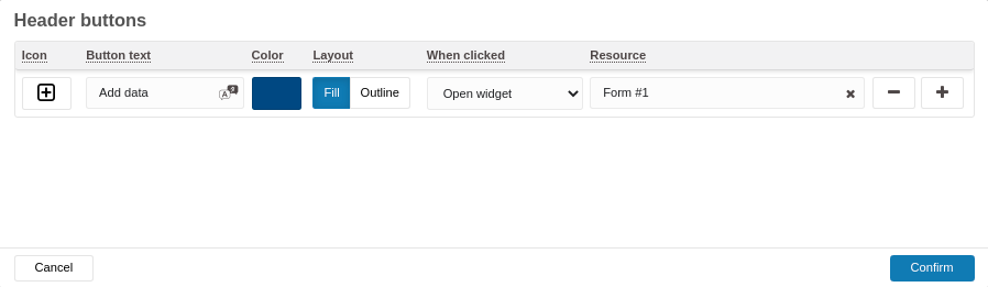
Header buttons (UI fields)
The header buttons panel includes fields to configure each custom button:
- Icon — Icon displayed on the button.
- Button text — The label shown on the button.
- Color — Button color.
- Layout — Button style (e.g., Fill, Outline).
- When clicked — Action performed when the button is clicked (for example, "Open widget").
- Resource — Target resource for the action (for example, a specific Form).
Example entry shown in the UI:
- Icon: plus/add icon
- Button text: Add data
- Color: (blue sample color)
- Layout: Fill (or Outline)
- When clicked: Open widget
- Resource: Form #1
Additional UI controls:
- Add and remove buttons (+ / −)
- Cancel and Confirm buttons for the header configuration dialog
Additional configuration notes
- The widget header is enabled for all widgets. You can configure it by selecting the Header tab in your widget configuration.
- A maximum of 3 buttons can be added per widget.
- Icon: Optional icon displayed to the left of the button text. If there isn't enough room, only the icon will appear.
- Button text: No character limit, but longer text consumes more space; keep it short for better layout.
- Color: The button’s background color; the text color is automatically adjusted for optimal contrast.
- When clicked: Choose an action (e.g., Open widget, Navigate to URL, etc.). You can select one of three options.
Best practices
If you use the Open widget action, consider hiding that widget in a Hidden tab. This keeps it out of view while still allowing users to open it via the header button.
.