Sidebar
The sidebar on the left side of your Run application lets end users navigate between dashboards. You can create buttons for quick access — not only to open dashboards but also to open other pages or to connect a new Wi‑Fi device.
Customizing the sidebar
You can customize your sidebar settings by accessing the Run module and selecting the Sidebar tab.
It is possible to modify the appearance of your sidebar with your own color palette. Learn more about Run Themes.
Dashboard Search Bar and Sorting Options
The Dashboard Search feature enhances the end‑user experience by providing a search functionality and sorting options for dashboards within the Run portal panel.
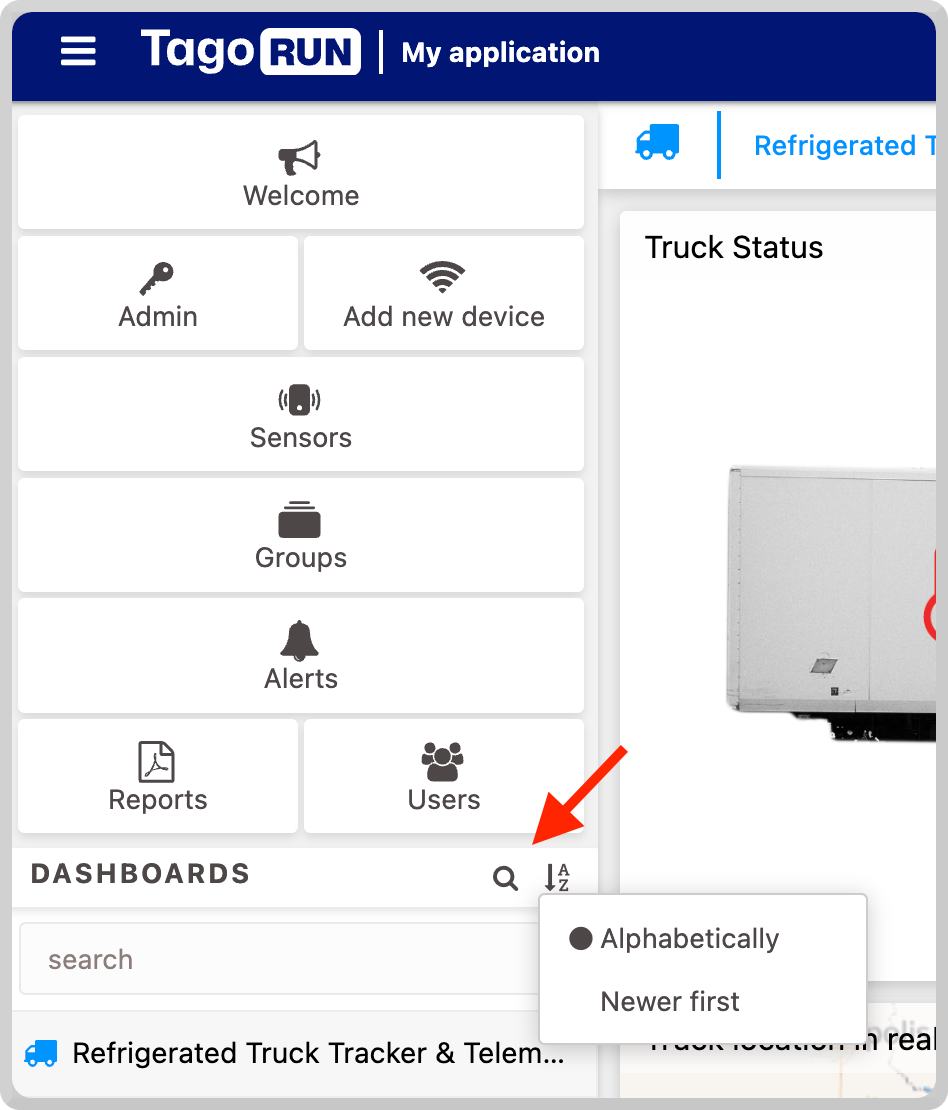
To enable the search bar, toggle the option “Enable dashboard search.” A new section will be added to the Run portal.
You can customize the search bar section label by entering the desired text; if left blank, the default label will be “Dashboards.” Additionally, you can use a KEY defined in your dictionary to dynamically translate the text to your end‑users’ language. Learn more about Using Dictionaries & Multi‑language.
Logo Button Configuration
You can define what happens when an end user clicks on your logo or what message is displayed when the mouse hovers over it.
1. Tooltip
To display a tooltip over your logo, write text in the Button tooltip field.
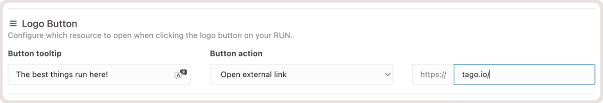
Notice that you can use a KEY defined in your Dictionary to display text that will be substituted according to the languages available for your end users.
2. Button Action
By default, when an end user clicks on your logo, they are redirected to your Run URL domain. You can customize what happens after clicking on it. The actions can be:
- Open Dashboard – opens the selected dashboard (the user must have access).
- Show iFrame – opens an external link inside the Run application; the page must be embeddable.
- Show HTML file content – displays a custom HTML file that can be hosted in Files.
- Open external link – opens a URL outside of Run.
You can also add the action “Open Setup Wi‑Fi Device.” To enable this option, navigate to the Mobile Features tab in the Run module and activate Setup Wi‑Fi device.
Sidebar Buttons
Buttons allow end users to quickly navigate between dashboards, pages, or scan a new Wi‑Fi device. Dashboards used as buttons are automatically hidden from the dashboard list on the sidebar, keeping the interface cleaner.
Label�
Define the text displayed under the icon.
Icon
Select an icon from our list or add your own using a URL to an SVG file. You can also change its color to match your project style.
Action
When you create a new button, it is disabled by default and will not be shown in Run. Choose one of the following actions:
- Disabled – removes the button from the application.
- Open dashboard – opens the selected dashboard (requires user access). See Access Management.
- Show iFrame – opens an external link inside Run; must be embeddable.
- Show HTML file content – displays a custom HTML file hosted in Files.
- Open external link – opens a URL outside of Run.
- Open Setup Wi‑Fi Device – initiates the process of connecting a Wi‑Fi device (enable via Mobile Features tab).
Platform
Choose where to display the button: Desktop, Mobile, or both.
Break Line
Customize how many buttons appear per line. The slider lets you move a button to a new line or place multiple buttons on the same line. You can have up to three buttons arranged side by side.
Visibility Conditions
By default, every button is visible to all users. To restrict visibility (e.g., an “Admin Settings” button only for administrators), set a visibility condition using user tags.